It's always frustration for house owners to deal with different types of household related tasks.
Scheduling repairs, managing contractors, tracking maintenance — the process is fragmented across phone calls, spreadsheets, and memory. Important deadlines slip. Trusted contacts are forgotten. The home, the largest investment most people make, is managed with the least systematic tools.

How might we make house management simple and easy?
To understand who is struggling with house management and why, I combined four research methods. Surveys mapped the breadth of the pain. Interviews surfaced the texture and emotion behind the data. Market research identified existing solutions and their gaps. Usability testing later validated whether the proposed flow actually relieved the friction.
A persona to anchor every design decision.
Synthesised from interview patterns: a working homeowner who values their evenings, doesn't want to become a project manager, and would happily pay for confidence that their home is being looked after.


Mapping the emotional arc of needing a household task done.
The map traces a homeowner from the trigger ("something is broken") through searching, deciding, scheduling, and post-task follow-up. It exposes where users feel stuck, where they doubt their choice, and where a calm, trustworthy interface could turn anxiety into reassurance.

The task flow distils the experience map into the smallest set of decisions a user has to make to get from "I need help" to "help is on the way". Every screen earns its place by removing a question, not adding one.

Pen-and-paper sketches let me move fast, throw away ideas without ego, and find the shape of the screens before committing to pixels. Two passes — a first version and an iteration — captured the jump from "this might work" to "this feels right".
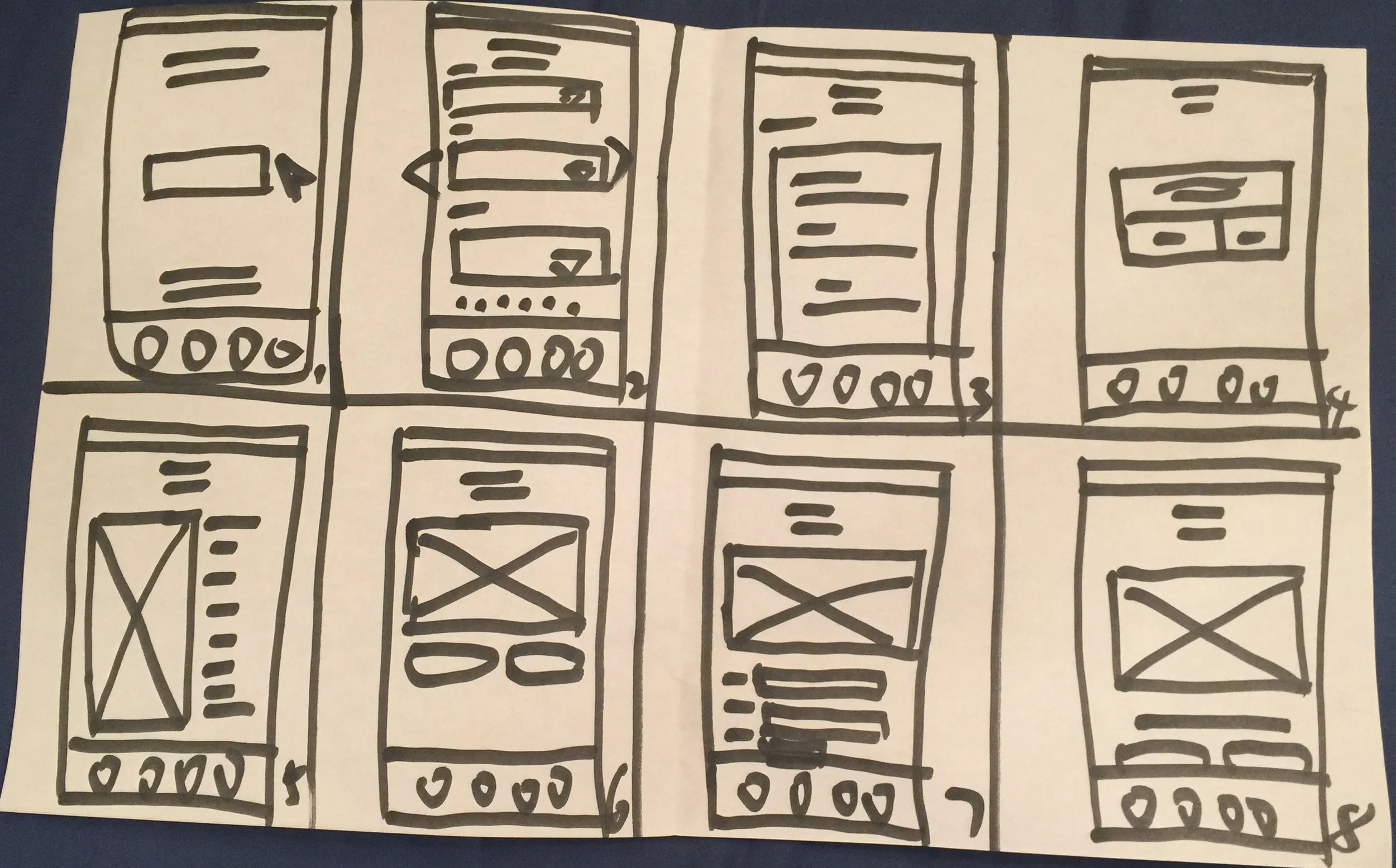
First version
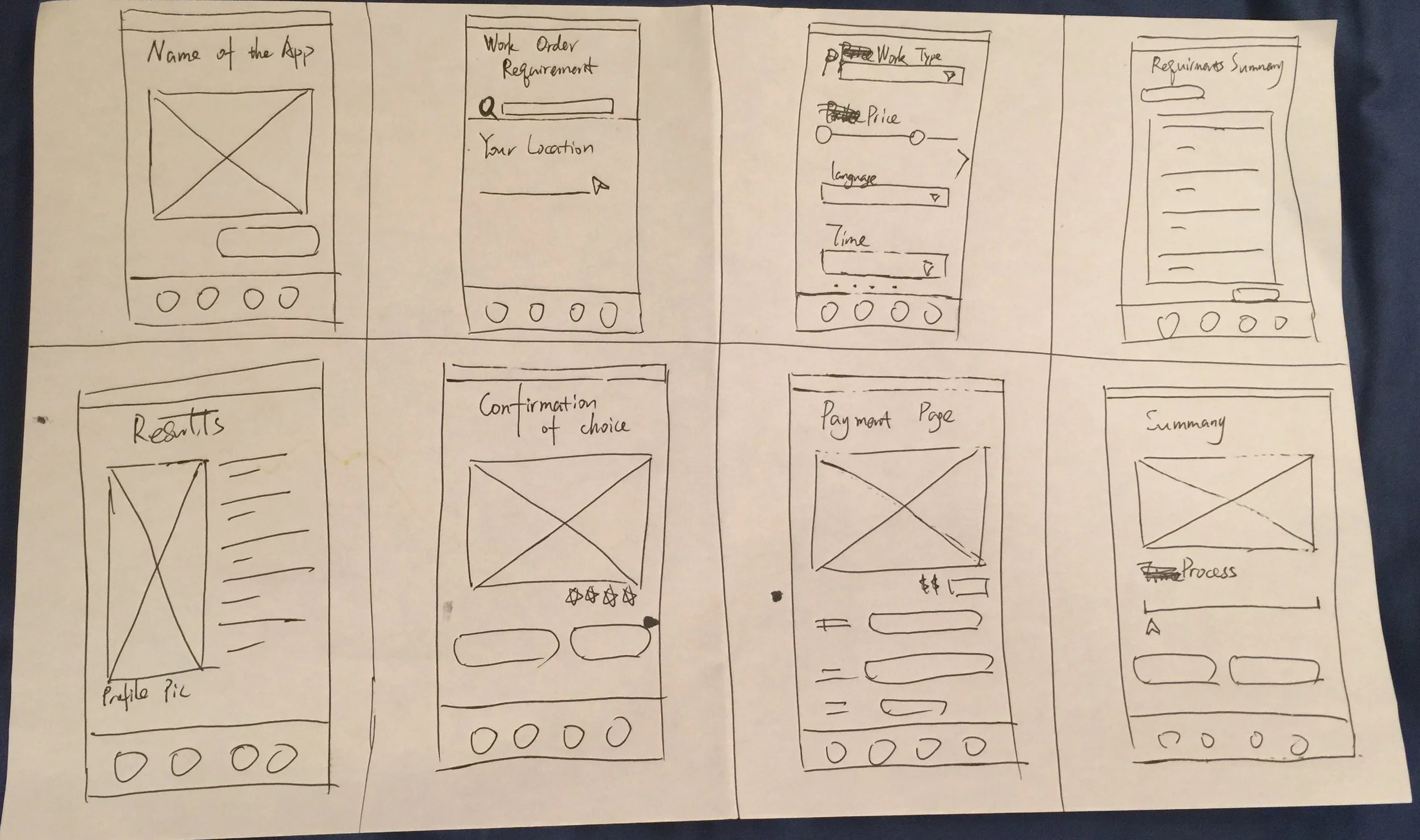
First iteration
Eleven wireframes covering the core booking flow.
Greyscale, no decoration — just structure, hierarchy, and the rhythm of how a user moves from home screen to confirmed booking. This is where the design's bones get tested.


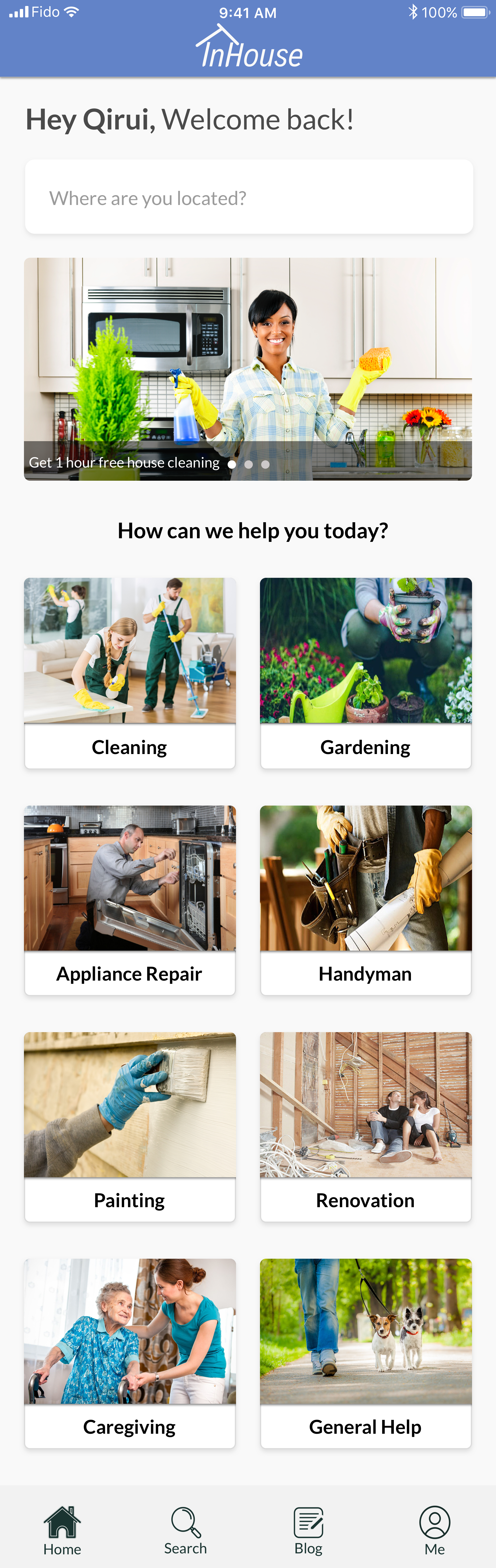
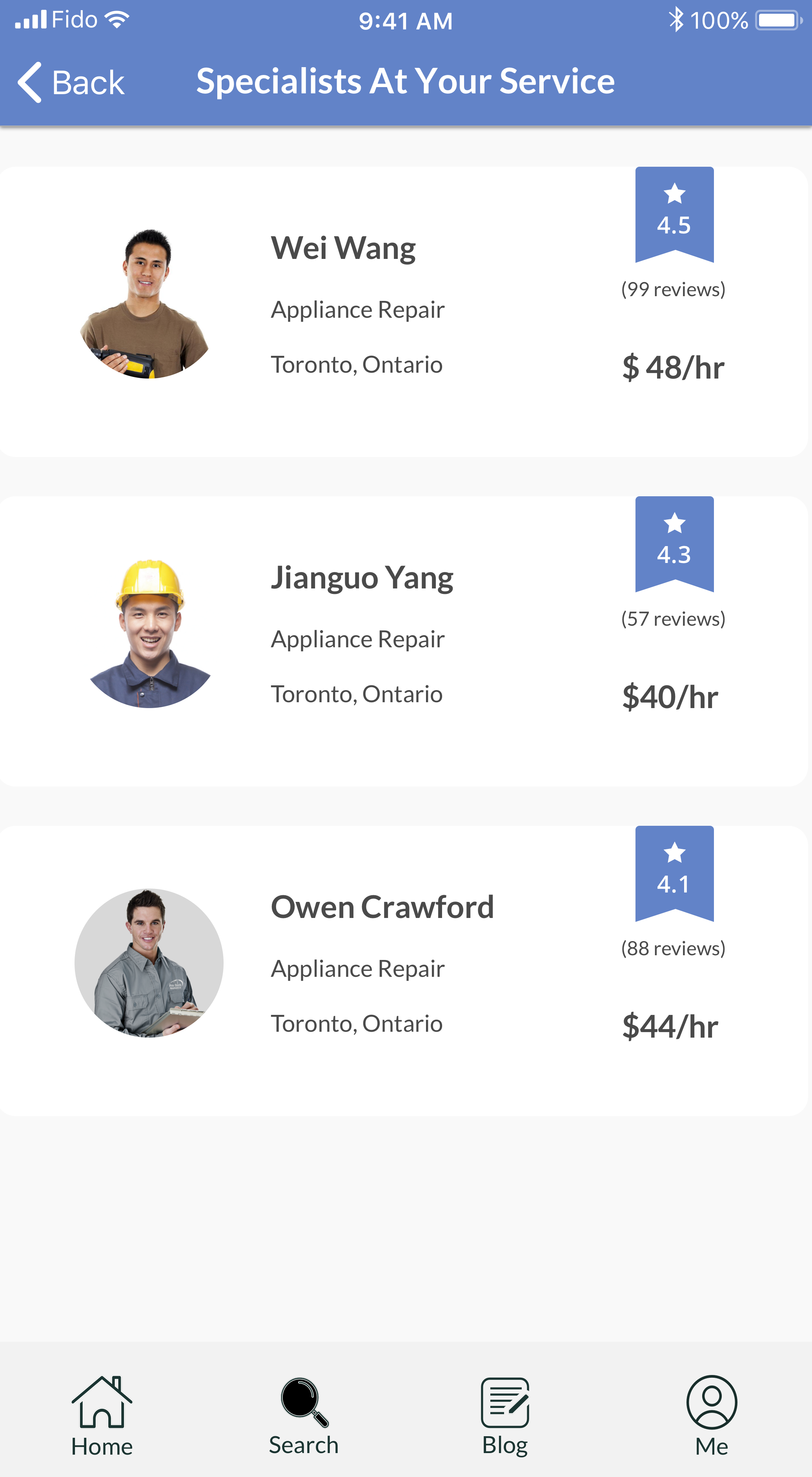
Twelve high-fidelity screens — color, type, and the feeling of a finished product.
The hi-fi pass takes the validated structure and dresses it: a calm purple palette, generous spacing, type that breathes. The intention is for the app to feel like a trusted assistant — never loud, never demanding.